ผลต่างระหว่างรุ่นของ "หน้าจอ"
Jump to navigation
| บรรทัดที่ 139: | บรรทัดที่ 139: | ||
== Mobile Interface: == | == Mobile Interface: == | ||
[[file:interface_app.jpg|700px|center]] | [[file:interface_app.jpg|700px|center]] | ||
''Click on each category to see more | ''Click on each category to see more'' | ||
{| style="width: 100%;" | {| style="width: 100%;" | ||
! style="text-align: center; font-weight: bold;" | | ! style="text-align: center; font-weight: bold;" | | ||
รุ่นแก้ไขเมื่อ 13:52, 13 กรกฎาคม 2559
Introduction
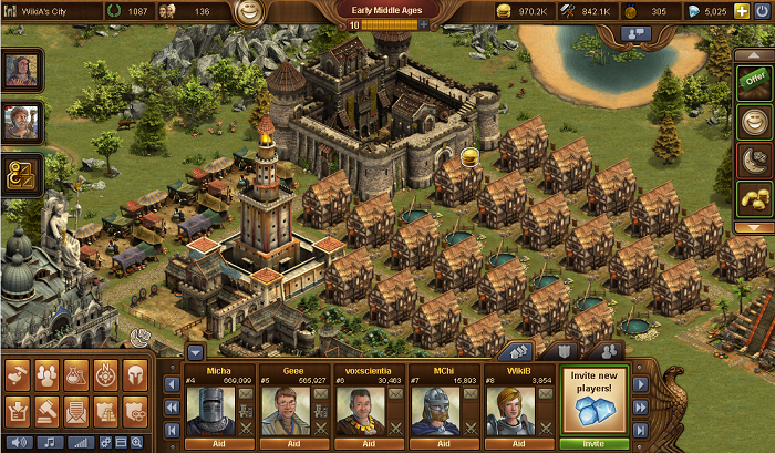
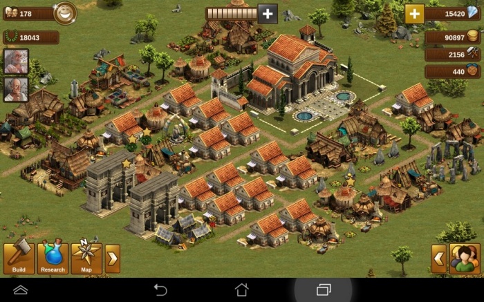
The Interface in Forge of Empires is very intuitive and easy to use. While there are many similarities between the browser and mobile versions, they differ on several important points
Browser Interface:
| Top left | Top center | Top right | ||||||
| Chat | ||||||||
| . | ||||||||
| Quest | Offers | |||||||
| Givers | Status bar | |||||||
| Collect All | ||||||||
| . | ||||||||
| . | ||||||||
| Main toolbar | ||||||||
| . | Social Bar | |||||||
| Settings |
|
Mobile Interface:
Click on each category to see more
| Top left Mobile | Top center mobile | Top right mobile | ||||||
| . | ||||||||
| . | ||||||||
| Quest | ||||||||
| Givers | Status bar | |||||||
| . | ||||||||
| . | ||||||||
| . | ||||||||
| . | ||||||||
| Bottom left mobile | Bottom right mobile | |||||||
| . |
|


